Categories
Painting

Chiaroscuro

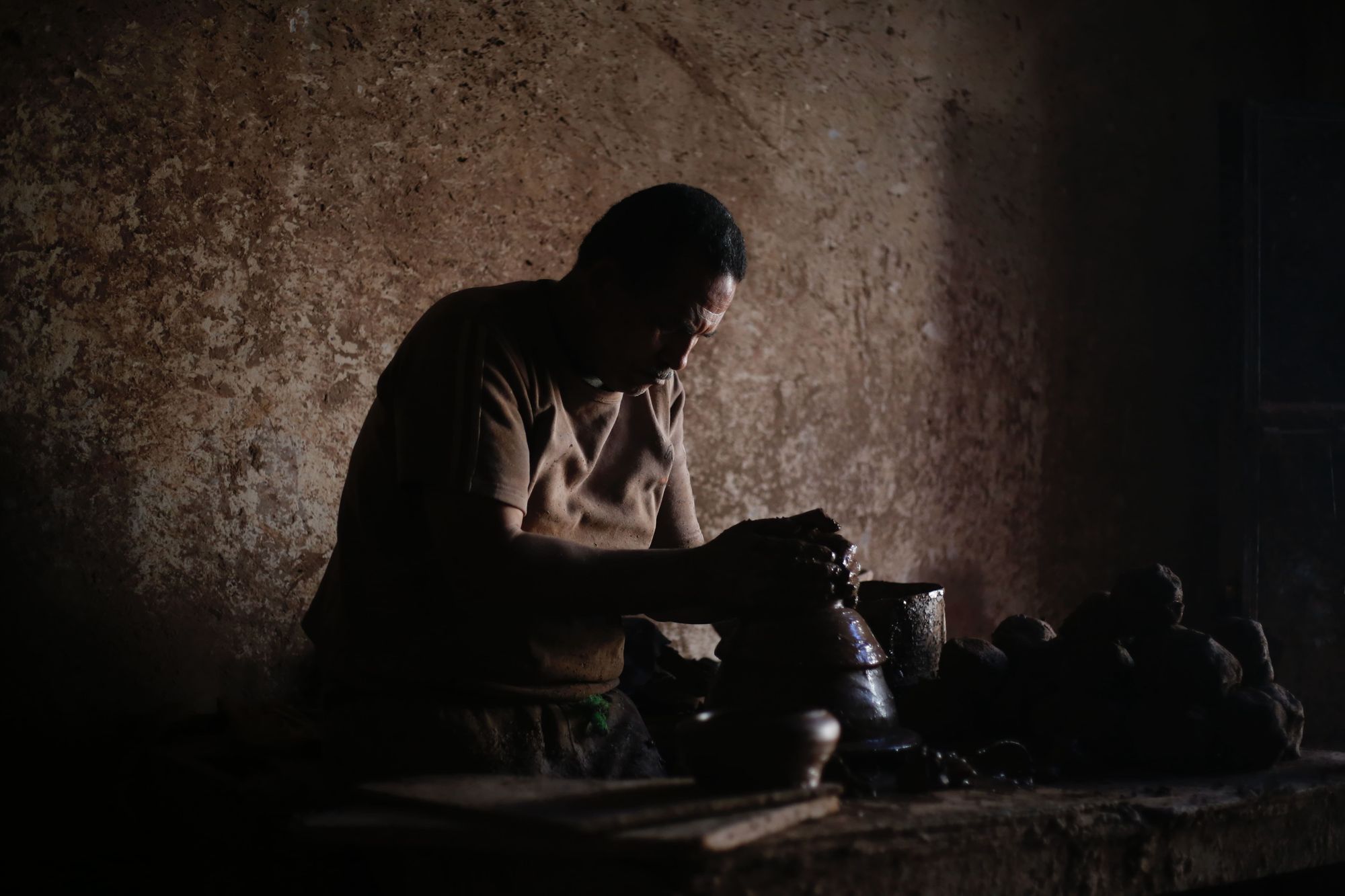
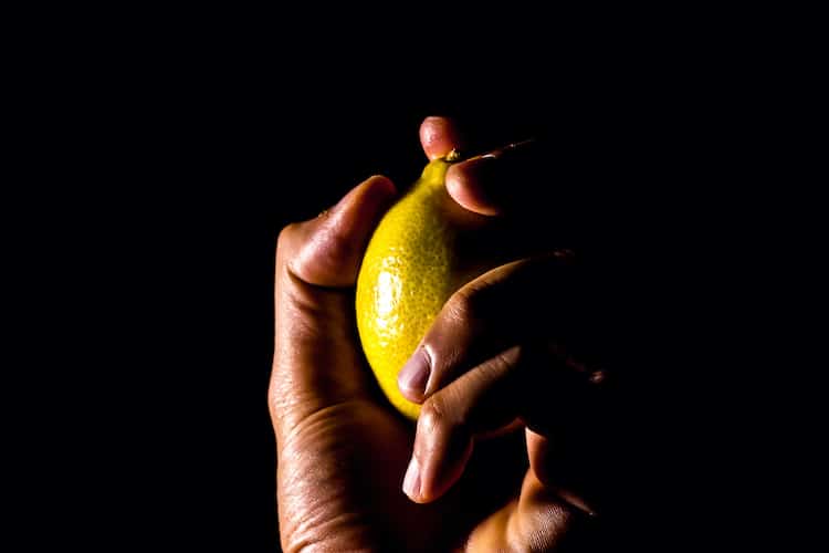
Chiaroscuro is an art technique that uses shadows and a single light source to create depth and drama. This technique can be used in drawing and print, but it is primarily seen in oil paintings.

chiaroscuro painting of oranges
GiuseppeSchiros / Getty Images

The term chiaroscuro comes from the Italian term meaning light to dark. In theory, all objects get their shape by the presence of light. By incorporating a gradient of light and dark, a figure can appear more three dimensional on a canvas.

This method of painting is challenging and time-consuming, even for seasoned artists. Several early artists like Rembrandt and Caravaggio showcased how dramatic and awe-inspiring this technique can be, which is why many artists continue to implement this method regardless of the technical difficulty.

History
Chiaroscuro-style painting dates as far back as the 5th century in Ancient Greece. The style was also seen in Byzantine era art as well as throughout the Middle Ages. By the 15th century, most religious painters were utilizing this technique in their paintings.

As time went on, several famous Renaissance painters would play with the balance of light and dark in their work. Some of these artists include Leonardo da Vinci and Raphael. However, the term chiaroscuro became well-known during the Baroque era with artists like Caravaggio and Rembrandt.

The main difference between Renaissance and Baroque paintings was how the play of light and dark was used to envoke a mood. During the Renaissance, soft light was cast on subjects to create calm and serene scenes. Artists of the Baroque period would use harsh light and dark contours to create drama and intrigue.

Subsequent art periods continued to use this technique. Throughout the Rocco period, artists like Fragonard and Watteau would paint scenes that highlighted light and dark. Romantic impressionist paintings also use a variety of heavy shadows and a single source of light.

Chiaroscuro used on Film and Photography

Chiaroscuro and Other Similar Techniques
Several painting techniques use the play of light and shadow to create an impact. Here are some other notable methods and how they differ from and are similar to chiaroscuro.

Tenebrism vs. Chiaroscuro:
Tenebrism is a technique from the Mannerist period. It is similar to chiaroscuro in that both methods use light and dark to create dimension. Again, chiaroscuro is used to create a realistic three-dimensional effect by casting shadows. On the other hand, tenebrism intentionally keeps bast sections of the painting dark to create drama. In essence, the distinction is with the type of light that is cast. Chiaroscuro illuminates a subject and casts shadows to create dimension. Tenebrism will only lighten a few small areas of the canvas to brighten a subject as if the subject is under an intense and narrow spotlight. Some paintings, especially those by Caravaggio, include both of these techniques at once.

Sfumato vs. Chiaroscuro:
In chiaroscuro, the meeting point between light and dark areas tends to be sharp and distinct. These contours can seem harsh and blunt at times. Leonardo da Vinci decided instead to implement a technique known as sfumato. This technique softens the blend between light and dark, as you see in the face of The Mona Lisa. Sfumato should blend light and dark subtly and without the use of lines or borders.


How to Use This Technique
Try not to be intimidated by this technique if you want to try it. No one expects artists to create a Rembrandt-like masterpiece when they’re first learning to paint chiaroscuro-style paintings. The best thing you can do is have the right set up and practice, practice, practice.

Here’s how to get started:
Gather supplies.
You’ll need some basic painting supplies. In this case, oil paint is the most versatile medium that is easily blended and layered. Purchase an inexpensive starter kit of oil paints if you don’t own some already.
Pick a subject.
Stick to something you are already confident drawing and painting. This object of study could be a still life or a portrait, but it doesn’t need to be too fancy.
Set up the lighting.
The lighting is going to be the most integral part of your set up. You’ll want to think like a photographer here to make sure that one light source is bouncing off your subject in the way you want. For a still life, create a small lightbox using a cardboard box. Paint the inside of the box black and cut a small hole into one side of the box. Set the box next to a window that gets ample natural light. The light should shine through the hole and illuminate only one side of your still life object.
Take a reference photo.
If you want to paint an original portrait, take a photograph first. Set your subject up in an area where light is only hitting one side of their face. Raise the contrast on the photo so you can see exactly where the light is hitting their face and where there are shadows.
Copy a master.
If you aren’t confident enough to create an original painting, look for a tutorial to follow online or print off a reference photo of a famous work and try to copy it. Pay special attention to how dark and light are shaded and blended within the picture.


Chiaroscuro is an art technique that has been used for several hundreds of years. Modern artists have evolved the concept to include a wide variety of subjects and mediums. If you want to try this method for yourself, practice your blending skills until you feel confident enough to take on a painting.

Categories
Uncategorized

Elements of a Still Life Painting

A Step-by-Step from Sheldon Tapley

Reposted from https://www.artistsnetwork.com/art-mediums/oil-painting/elements-of-a-still-life-painting-a-step-by-step-from-sheldon-tapley/

With theatrical splendor, Sheldon Tapley celebrates excess, reinventing the still life tradition by incorporating the figure and complicating the design. Here, he gives instruction on the elements of a still life painting.

From Simplicity to Complication: Elements of a Still Life Painting
By Sheldon Tapley

1. Transferring the Drawing: I usually begin with a drawing (not shown here), which I transfer, using Saral transfer paper, to the primed aluminum laminate panel. I brush transparent red oxide thinly over the transferred lines and let them dry.

.

  1. Blocking In: I use a hog bristle bright brush to scrub in a thin, flat layer of color. If the paint doesn’t flow easily, I add a drop of mineral spirits.

.

  1. Choosing One Area: I choose one area, usually a key object in the composition and, using bristle brushes, add detail to it. This is just a first pass, so I avoid getting too detailed. For this piece, I made some of the edges on the table with a ruler; other edges, like those on the gourd, I kept soft. If the paint doesn’t flow easily enough, I add a drop of M. Graham walnut alkyd medium. At this point, I wouldn’t use mineral spirits in the paint because mineral spirits can dissolve the binder.

.


4. Developing One Area: I worked up the gourd in greater detail; I added its shadow and developed the background around it. I wanted to see the character of the gourd clearly before I progressed to other areas.

.

  1. Establishing the Quality of Light: Still undecided about how to handle the light coming in from the window, I wondered whether I should include the shadow cast on the wall by the window wall. Eventually, I did, but here I was thinking that the table and objects should be suffused with light. I applied the green paint of the background wall generously; then blended it to a flat surface using large, soft, badger brushes. I allowed the light to flood across the edge of the pitcher to avoid building up thick paint at the boundary of the object.

.

  1. Developing Another Object: The flat, blocked-in pitcher became a three-dimensional object and acquired a shadow to attach it to the table plane.

.

  1. Within the Reflection: I worked up the table and the pitcher in greater detail. The reflection of Danville’s Main Street in the pitcher was so clear that it was like watching a little movie. I began to wonder if I was crazy to try to paint the scene! What you see here, the scene in the reflection, is the result of many tries.

.

  1. Making It Complex: I decided that the composition would benefit from including the shadow on the right part of the back wall. I described, too, the wall surface in greater detail. My initial plan, to make a simple design emphasizing two forms on the table, gave way to my persistent need for complication: I added a piece of rope.

.

  1. Adding Elements: A rope needs scissors! Not everything in a still life has to fit together thematically, but this juxtaposition is one I often enjoy painting. Also, I love the form of these scissors. The plastic handles have a dynamic, subtle design, as if the designer had been looking at Brancusi or Noguchi. I drew the scissors with blue-gray paint thinned with M. Graham walnut alkyd medium because I was impatient to finish and I wanted these last stages to dry quickly.

.

  1. Making Modifications: I was dissatisfied with the right edge of the pitcher, where the dust on it caught very strong light. I’d reworked this difficult passage so much that there was a distracting ridge built up along the contour of the pitcher, so I sanded the area gently with 600-grit sandpaper, as a prelude to reworking it with smoother paint. The scissors were nearly done; the cast shadows of the gourd and scissors would become more intensely warm.
“Dust” (oil on aluminum laminate panel, 16×20) by Sheldon Tapley

11. Seeking Transparency: Some of the last layers were glazes, in which I used more medium to allow transparency in colors like the blues and purples of the pitcher in Dust (oil on aluminum laminate panel, 16×20).

Categories
Uncategorized

Steps in Painting Landscapes

Materials

  • An easel
  • A canvas
  • Paints
  • A filbert brush
  • Water
  • A jar
  • Rags
  • A palette
  • A pencil
  • And a sketchpad

Steps

Step 1

Choose your paint

Choose if you want to work in oil, acrylic or watercolor. Whatever you decide, choose the appropriate paints for your medium.

Step 2

Get a filbert brush

Leave all of your brushes at home except for a single filbert brush. As you progress in landscapes, add and experiment with other brushes.

Step 3

Bring water and rags

Bring lots of water and rags.

Step 4

Set up your easel

In the middle of the day, go set up your easel In a comfortable location that has a good view.

The light changes the least over a given number of hours in the middle of the day.

Step 5

Sketch your drawing

Using the pencil, sketch your painting on your sketch pad. Make only very rough shapes — triangles, arcs, blobs —to give it a general look and feel.

Painting is less about the medium (paint, pastel, pencil) and more about how you create the image. Drawings use lines. Paintings use shape.

Step 6

Work out values

When you’re happy with the composition, it’s time to work out the values, or lightness and darkness. On a scale of 1 to 10, choose a key object with a middle value.

Step 7

Eye the composition

Eye your composition, or structure. What’s lighter than the object you chose? What’s darker? What’s in between and by how much?

Step 8

Choose values for all other objects

Using that value as your key, begin choosing values for all of the other objects in your composition.

Step 9

Color your key object

Once you’re done, turn to the canvas and select a color for the key object.

You will probably need to mix paints to get the value you need.

Step 10

Paint the rough key object

Paint the rough shape of your key object.

Wash your brush thoroughly between colors in your jar of water. Dry on a rag.

Step 11

Paint another object

Choose an object touching your key object. Choose a color and assign it a middle value. Paint its rough shape. Stick to the middle values, avoiding highlights and shadows at this stage.

Step 12

Keep painting

Keep working around your composition until you’ve blocked off the whole piece.

Step 13

Appraise composition

Step back and look at your composition. Does it feel right?

Step 14

Assign and develop contrast

Now go back in to your piece and begin assigning and painting colors with more accurate values for ever-smaller shapes around the piece. Your contrast will begin to develop.

Start with lighter values, then move toward darker values.

Step 15

Add shadows

Add in your shadows in. Generally, you’ll want a cooler color. Avoid pure black.

Step 16

Add highlights

Finally, add the highlights. These will be something in the family of the color of your light source, but avoid pure white.

Step 17

Sign and date the painting

When you’re satisfied with your painting, sign the front, and, when it’s dry, use a marker on the back to identify the title, place, and date.

Categories
Uncategorized

Oil Painting

Read the following topic on the Steps on creating an Oil Painting. Take note of important words to add in your vocabulary. WATCH the VIDEO about this lesson.

VOCABULARY (Words to learn its meaning/definition):

PALETTE – A flat plate used by artists to mix paint
CANVAS – A White Cloth stretched on wood where the painting will be placed
SUPPLIER – Person/People who provide specific things
BRITTLE – Can easily break
CADMIUM – A Chemical Element (Cd) that is found in some oil-based paint.
SANDPAPER – A paper material with rough sandy/grainy texture used to smoothen surfaces
LINSEED – a seed of the Flax plant, Linseed oil is mixed with oil paint to give more content
TURPENTINE – a liquid solvent used to remove paint, or mix with paint to make it more watery or diluted
EVAPORATE – when liquid turns into gas
THINNER (noun) – a liquid solvent used to dilute or remove paint, another name for Turpentine
MINERAL SPIRITS – Liquid material taken from minerals or rocks
LINT-FREE – Having no dust, tiny particles or lint
LEAN – Thin but strong
ELASTIC – flexible and easily changing characteristic
STROKE – a line or mark created with a pen or brush
CLARITY – Clear and sharp looking view
GLOSS – Shiny and glazing
MOISTEN – Slightly wet
SOLVENT – a Liquid that can dissolve another to form a solution

You Will Need

oil paints
paint brushes
A canvas
A palette
Linseed oil
A palette knife
Turpentine or Thinner
A cup
Rags

Steps

Step 1

Buy quality oil paint and brushes

Buy oil paints from an art supplier, where well-formulated oil paints are less likely to dry yellow and brittle or harden in the tube. Get sable brushes of various shapes and sizes.

Keep in mind that paints with cadmium will dry in days rather than hours.

Step 2

Pretreat with gesso

Pretreat an already stretched canvas with gesso. To further fill pores and smooth the surface, use fine sandpaper, and cover a second time. Once the gesso dries, sketch your scene.

Step 3

Squeeze paint on palette

Set the canvas on the easel. Squeeze out the “fat” or thick paint from the bottom of the tube onto the palette.

Step 4

Mix linseed and mineral spirits

Mix linseed oil into the darker colors to be used on the under-painting, since it dries better. Use the palette knife to work in mineral spirits to make the paint lean and elastic.

Essential oils like turpentine evaporate well and are good thinners. Resins and balsams add clarity and gloss.

Step 5

Brush lightly

Use a light hand when applying the paint, and a wider stroke when applying more medium.

Step 6

Correct mistakes

Correct mistakes, wiping away the paint with the palette knife and use a turpentine-dipped, lint-free cloth to finish removing. When you repaint, sand that surface first and moisten it with a touch of mineral oil.

Step 7

Clean brushes as you paint

Dip the brush in a cup filled with a small amount of turpentine to clean as you paint. Dry the painting in light whenever possible, as daylight cures the colors better.

Painting thinner layers over a thick drying layer will distort the surface of the painting.

Step 8

Finish session

Wipe your knife and handles with rags when you’re finished. Stir the brushes in solvent, but don’t soak them overnight. Scoop leftover globs of paint from the palette so that the surface is smooth for the next round.

Categories
Uncategorized

Painting with Acrylics

Materials

  • A Canvas
  • Acrylic paint
  • Brushes
  • Rags
  • A Palette
  • A Pallette knife

Steps

Step 1

Choose a surface

Choose a surface for your painting. Canvas is the most common, but wood, masonite, and many others are also used.

Step 2

Pick your colors

Choose only a few colors, mixing them for countless shades.

Step 3

Buy basic brushes

Buy a few basic brushes: a large gesso brush to prepare canvas, a fine round brush for detailed work, and a flat inch-wide brush.

Splurge for better brushes. Cheap ones tend to shed hair.

Step 4

Prepare the canvas

Prepare your surface with gesso to make it smooth. Apply an even layer and let it dry. Lightly sand and repeat until your desired smoothness is achieved.

Step 5

Use a medium to dilute acrylic

Use a medium, such as a gel retarder or gesso primer, and water to dilute acrylic paint. It will help prevent cracking, and your painting will last longer.

Mediums also add texture to your acrylics.

Step 6

Add to your collection

Add a palette knife, fan brush, and other tools to your collection to create your personal style.

Did you know? Medieval gesso was a mixture of plaster of paris, white lead, and red clay for color.

Categories
Painting

How to find Painting Ideas

Source: http://painting.about.com/od/inspiration/tp/painting-ideas.htm

By Marion Boddy-Evans

If you haven’t got great painting ideas, then all the technical painting skills in the world will be near useless. So where do you find ideas you can use to create and develop your own, distinctive paintings ? Here are the options and approaches I believe in.

I also think it’s crucial to allow time to experiment. Be gentle on yourself and allow yourself to make mistakes, to go down dead-ends, to see what might develop. Use each of these painting ideas as a starting point, not the end point.

1. List Your Options, Your Likes and Dislikes

You can’t have painting ideas without having an idea of what style of painting you want to make, or what genre. So the first step to finding painting ideas is to make a list of what you options you want to consider. What subjects / styles do you think you’d like to make (also list what you know you don’t want to do), then narrow it down from there. For example, do you want to paint figures, landscapes, abstractions …? What style do you want to use: realistic, expressionist, abstracted …? Are you going to use a limited palette, or have one color dominate? Too many options is as paralyzing as too few, so narrow your list down to one or two and start working with those. Use these printable art journal pages to get going.

2. Put Painting Ideas Down on Paper, in a Sketchbook or Journal

Don’t be misled or intimidated by the pages you see reproduced from sketchbooks where everything is immaculately executed, with every page a perfect sketch. A sketchbook is a working tool for ideas and record keeping, not a work for display. What you put in it and how you do it is entirely personal, like a diary. I use a sketchbook more like a creativity journal, with as many words as pictures. I have a pocket sketchbook and pen with me most of the time, and a larger one for when I’m painting on location. I don’t worry about being neat or organized, I’m merely recording thoughts and ideas for possible use on the proverbial rainy day.

3. Gather Painting Ideas from the World You Live In

While I love to travel to new and favorite locations, the place to start gathering ideas is where you are right now. Your living room and kitchen will provide props for a still life. A garden will provide plants and flowers that change with the seasons. A scenic viewpoint will provide a landscape or cityscape that changes with the time of day. Persuade family members to pose for you, or sketch passer’s by from a coffee shop. Paint the family cat or dog when its asleep. Take photographs to use as reference if you can’t spend much time at a location.

4. Use an Idea More than Once

There’s no rule that says you can use an idea only once. On the contrary, a painting idea can be used to create a whole series. Take an old painting you like and work on variations, pushing the idea around and further e.g. different color sets, different angles, different lighting. Just look at what Monet did with his haystack paintings.

Categories
Painting

How to Paint

Painting is a medium through which many people find that their emotions and thoughts can shine through. No previous experience is necessary, and if you’ve ever taken an art class, even if it was finger painting in elementary school, then you’ve had an introduction to painting.

Method 1 of 5: Choosing a Medium

  1. 1 Consider your goal. What types of painting and art are you hoping to create? Do you need a lot of time to work on a single project, or do you want hope to fully finish pieces in a single setting? Do you have a spacious work area that is well ventilated, or a small area that might cause fumes to build up? How much money do you hope to spend on supplies? These are all important things to consider before committing to a type of paint.
  2. 2 Try watercolor paint. Watercolors come in cases or small tubes of pigment. When used alone, they are thick and opaque, and do not cover much area. When used in combination with water, they will thin out and become transparent. Watercolors are used on specific paper made for use with watercolor; any old piece of paper will not necessarily work very well. These paints don’t allow thick layers of color, but give the beautiful effect of thin, translucent layers of color.
    • Watercolor paint sets begin for as little as $20 and can range to prices far above $100. For a quality beginners set of paint, expect to pay between $50-$80 to start.
    • Because watercolor can only be done on special paper that won’t wrinkle and curl when it comes into contact with water, there are limited options for things to use as a “blank canvas,” unlike acrylic and oil paints.
  3. 3 Think about using acrylic paints. Acrylic paints are another water-based paint option with a fast drying time and low fumes. These are a great choice for anyone interested in whipping up a completed painting in a single day. Thick layers of paint can be stacked up for a beautiful 3D effect, and because they are water soluble they can be wiped off surfaces and washed out of textiles. The downside is that because they dry so quickly, blending and wet-on-wet painting techniques can be difficult.
    • The application style and overall appearance of acrylic paints is most similar to oil paints.
    • Acrylic paints are typically less expensive than oil paints, and require many less additives. They are a bit more intuitive in terms of layering and technique than watercolor paints, though.
    • Acrylic paints are much less toxic than oil paints, as they don’t give off fumes or require heavy ventilation. If you are working in a small space or have pets and children around, acrylic paint is a safer option than oil.
  4. 4 Consider using oil paints. Arguably the most advanced option of the three painting mediums, oil paints are slow-drying and thick, they offer dozens of specialized techniques. These take about three months to dry completely, making them the best option for someone who needs or wants a lot of time to work on a painting to completion. On the downside, they are slightly toxic and require a great deal of ventilation when being used.
    • Oil paints are the most expensive option of the three paint mediums, and require several additional supplies including mineral spirits and gels.
    • Oil paints have the richest color of the three paint mediums, and will dry true to the mixed color.[1]
  5. 5 Get quality paints. When you’ve decided on which type of paint you want to use, you will have to select a brand to go along with it. As a beginning painter, it is tempting to want to purchase the cheapest available brand. However, you will save yourself time and money (in the long run) by purchasing quality supplies. There are higher levels of pigment in good quality paint, meaning that a single stroke is all that is required while 2-3 may be needed to get a solid coat of paint with a cheap paint. You’ll end up using a cheap tube of paint much faster (and with much more frustration) than a more expensive tube of paint.

Method 2 of 5: Getting the Remaining Supplies

  1. 1 Choose your brushes. There are two primary things to pay attention to in choosing a brush: the shape of the bristles, and the material of the bristles. Bristles come in three shapes: round (with a pointed cylindrical tip), flat, and filbert (like a flat brush that comes to a point). The bristles can be made out of sable (mink), synthetic, synthetic mix, hog, or squirrel. hair.
    • For watercolor painting, the best brushes are sable or squirrel, with a round tip.
    • The best paint brushes for acrylic painting are synthetic or synthetic mix with a flat tip.
    • For oil painting, the best options to use are synthetic mix and hog with a filbert tip.
  2. 2 Get your canvas. Stretched canvas is the best option, as it is relatively cheap and all three types of paint will work on it. However, thick drawing paper, canvas board, and watercolor paper are all good options as well. Oil and acrylic paints can be used on most smooth surfaces, including wood and plastic. Watercolor paints can only be used on special paper and canvas or fabric.
    • Don’t use regular printer paper or another thin paper for painting, as the paint will be too heavy and wet and will cause it to curl and warp.
    • If you plan to paint on wood or plastic, you will have to prime it first so that the paint sticks.
  3. 3 Get your other supplies. In addition to those primary supplies, you will need a pallet, jars full of water (two is good), and a rag, an old shirt or apron to wear. Other specialty supplies are required for oil paints, but are not needed for watercolor or acrylics. It is helpful to get gesso as well; it is a white primer that preps any surface (canvas and paper included) to create the best painting surface.[2]
    • Not necessary for most painting but often desired, an easel can be used to prop up your painting. Otherwise, any flat, stable surface will work for painting on.

Method 3 of 5: Mixing Colors

  1. 1 Familiarize yourself with the color wheel. The color wheel is a map of colors, showcasing the ways new colors can be created. There are three sets of colors present: primary, secondary, and tertiary. Primary colors are: red, blue, and yellow. These are colors that come straight from a tube; they cannot be made from mixing other colors. However, secondary colors (purple, green, and orange) can be made from the primary colors. Tertiary colors are in between primary and secondary on the color wheel (think teal or peach).
    • Red + Yellow = Orange
    • Yellow + Blue = Green
    • Red + Blue = Violet
  2. 2 Mix your colors. Nothing is worse than creating a painting using colors only straight from the tube. Mix your colors together to create new variations; mix the two primary colors in equal amounts for a true color, or add a little more of one color than the other. For example, making purple with slightly more blue than red will result in a bluish indigo color, while mixing with more red may result in a deep maroon.
  3. 3 Create different tints. Adding a small amount of white to any color will make it lighter, turning it into a tint. Most from-the-bottle colors are very vibrant and bold, and can be made more pastel-like by adding white.
    • It is harder to add white to a color, so try adding a bit of your color to white paint first. You will have to use less paint to make a tint in this fashion.
  4. 4 Mix some shades. The opposite of a tint, a shade is when you mix any color with black. This makes the color slightly darker, i.e turning red into burgundy or blue into navy. It is easiest to add a small amount of black to your color (rather than adding your color to black paint) to accomplish your shade. In this case, less is more – always start with the smallest amount of paint possible to avoid making a drastically different color right off the bat.
  5. 5 Create different tones. If a color is too bright for your liking, mix the color’s opposite into it to dull the vibrancy. Doing this is changing your hue (true color) into a tone; you’re toning the color down. A color’s opposite is the one directly across from it on the color wheel. For example, the opposite of red is green, yellow is violet, and blue is orange.[3]

Method 4 of 5: Learning the Elements of Painting

  1. 1 Understand the use of lines. The most basic type of line used in art is a contour line; this is the line drawn to outline an object. Some painters include contour lines around their subject, while others only use patches of color to show shapes. Determine whether or not or intend to use very obvious lines (such as contour lines) in your painting or not.[4]
  2. 2 Learn how to build up shapes. Every object that can be painted is a culmination of several shapes put together. The biggest issue beginner painters have is trying to see one subject as a single shape, rather than a layering of many shapes. Instead of focusing on drying the outline of a figure, consider it as multiple shapes that can be connected.[5]
  3. 3 Understand value. Value is what color your figure is when converted to the gray scale; how light or dark a certain color is. Value is important when mixing paints, as colors can be deceptive when mixing unless thought of in terms of lightness and darkness. Realize that most paintings will only contain a value range in the bottom third (mostly light colors), the middle section (mid grays/medium tones), or in the top third (mostly dark colors) of a gray scale.[6]
    • Unless there is heavy contrast, the values in your painting should all be similar to each other.
  4. 4 Use your space effectively. Because you’re working on a flat surface, you need to create the illusion of distance through the use of space. To maintain a flat surface, keep objects the same size and spaced out. To create depth, overlap shapes and make things further away smaller while things close to the viewer should be larger.[7]
  5. 5 Learn how to create texture. For things to look touchable in your painting, you need to create the illusion of texture. Texture is created by using different brush strokes and moving the paint in different ways on the canvas. Short, quick brush strokes will add fur-like texture while long, flowing brush strokes will make things look softer and longer. You can physically build up the paint on the canvas to create texture as well.[8]
  6. 6 Create movement with your paint. Movement is like the continuation of texture, but on a larger scale. Movement is created when a texture pattern is repeated over and over on the entire canvas. Not all paintings require movement, but if you are trying to create a realistic painting, then movement is an important element to incorporate.[9]
  7. 7 Look at your overall composition. The layout of your painting, the placement of objects and figures, is known as the composition. In order to create an interesting composition, figures must be placed in such a way as to cause the viewer’s eyes to circle the entire painting. Avoid putting a single figure in the center of your painting, as this composition is the most basic. Create interest by putting a single figure on an intersection of thirds, or by adding other interesting objects to the background.[10]

Method 5 of 5: Creating Your Painting

  1. 1 Choose a subject. The most important decision of your painting is deciding on a subject to focus on. For most beginner painters, it is easiest to choose an image (which is already flat) and painting a copy of that rather than choosing a 3-D object. To start, find something with basic lines and shapes, without too many colors, that would be easy to test your painting skills on. Common beginning painting subjects include:[11]
    • A bowl of fruit
    • A vase of flowers
    • A stack of books
  2. 2 Create a sketch. Although it is not a requirement, many painters find it helpful to draw a rough outline of their figure on their canvas prior to painting it. Use a light graphite pencil to gently sketch the outline of shapes and figures on your canvas. You will be painting over this, but having a light outline will help you to keep your paint in the right areas.
  3. 3 Find the light source. The colors your mix and the placement of paint on your canvas all rely on one major things your light source. Look at your subject, and determine where the lightest areas and the darkest parts are. Mix your paints with these in mind, creating several shades or tints of a single color to effectively blend colors together if necessary.
  4. 4 Start painting the background. When painting, it is best to work from the back to the front. This will help you to accurately layer objects and create the perception of distance. Paint with a single color at a time, going back and adding other layers of color as your work. Your background should be painted first, and you can add objects closest to the foreground later.
  5. 5 Add in your subject. When you’re happy with the background, you can add in objects and shapes. Work with layers of paint, similarly to the way you added the background in. Your subject is the center of attention for your painting, so it is important that you spend plenty of time paying attention to incorporating all the elements of art into it. Analyze it from all perspectives, and focus on recreating shapes rather than the entire figure.[12]
    • If you’re having a difficult time painting your subject accurately, flip your painting upside down. Painting it from a different angle will force your eye to look at the shapes that make up the figure accurately, rather than the symbol of the shapes your mind creates.
    • Start with the lightest colors, and then work with darker colors. It is difficult to layer dark colors over light ones, so start with whites and pastels before moving onto hues and tones.
  6. 6 Add in details. As you begin to finish your painting, add in the details you want for your background and figures. Many times this includes adding texture with your brush, a wash or glaze, and small or intricate figures as an overlay. This is the time for you to really get minute and focused on finishing touches.
  7. 7 Clean up. With the completion of final details, your painting is done! Touch up any mistakes on your painting, sign the corner, and clean up your work materials. It is very important to thoroughly clean your paint brushes so that they stay in good condition and will work well for future projects. Save any paint that you have left in containers, and store away your art supplies.

Tips

  • Making skin tone doesn’t have to be tricky, but if you just mix orange and white for a peach tone, you’ll notice it looks flat and unrealistic. Take a moment to look at your own skin. The underlying veins make all the difference in colors. For light skin tones, add just a touch of green, and for dark skin tones, just a touch of blue.
  • Try to befriend other painters. In some art schools or community-based art programs, they will have an open studio session where artists can use the same space to work. Talk to others about their methods and preferred style, watching other people work can show you what else is possible.
  • Have a look at some classic examples of paintings, such as the work of Pablo Picasso, Johannes Vermeer, Vincent Van Gogh, Salvador Dali, Frida Kahlo, Jackson Pollock, Edvard Munch, and Pierre-Auguste Renoir. They will give you an idea of different styles of painting.
  • Watch movies about art, such as:
    • Girl with a Pearl Earring, which portrays the art of Vermeer. Several scenes deal with color theory and painting methods.
    • Frida, about the life and art of Frida Kahlo, gives excellent examples of illustrating vision and expression, also painting techniques.
  • Be spontaneous, if you have no idea what to paint, dip your brush in random colours and stoke it on your canvas, you’d be suprised what you create, maybe a subconcious buried passion.
  • Visit art museums in your local area. If there are no museums, check in with art departments in colleges and schools nearby to see if they have anything on display. Some popular galleries in cities have online tours and high-resolution photographs of paintings.

 Warnings

  • Don’t give up too soon. Painting is a typically long and repetitive hobby and can take anywhere from half an hour to months to finish just one piece. Always remember, most art looks bad until it’s finished. If you’re not happy with the way it looks, just give it time and keep working. Although overworking a watercolor painting can make it muddy, a new layer on an acrylic painting serves to correct, hide, enhance the layers beneath it.

Things You’ll Need

  • Paints, either watercolor or acrylic.
  • The appropriate base material for your medium: watercolor – watercolor paper. Acrylic – stretched canvas, canvas board, acrylic paper or even masonite.
  • Brushes of a variety of sizes in synthetic fiber.
  • A cup of water.
  • Reference subject (physical model, photograph, an image from a publication, etc.)
  • A palette
  • Pencil and rubber for sketching preliminary design (optional).
  • Sketch pad for collecting ideas (optional).
  • An easel (optional).

**Source: http://www.wikihow.com/Paint

Categories
Painting

Choosing Paintbrushes

Step 1

Steps

Decide on synthetic or natural

Decide if you want a synthetic or natural-fiber brush.

When starting out, go with the less-expensive synthetic. Save natural-fiber for when you’re more experienced.

Step 2

Choose medium

Decide what medium you’ll be working in.

If you’re painting in acrylics or oils, start with synthetic brushes because these paints are harder to clean out of the brush.

Step 3

Familiarize yourself w/ 8 types

Familiarize yourself with the 8 main types of brushes: round, flat, bright, filbert, fan, angle, mop and rigger.

round brush (closely arranged bristles for detail); flat blush (flat end for quickly moving paint around); bright brush (flat but with shorter, stiffer bristles); filbert brush (domed ends); fan brush (for blending paints); angled brush (general detail brush); mop brush (broad soft paint application); rigger (round brush with long hairs)

Step 4

Hold brush

Pick a brush and hold it in your fist, bristles up.

After rubbing, the whole brush should take its original shape, and no bristles should fall out.

Step 5

Choose flat & filbert

Choose two workhorse brushes—a flat and a filbert—as your main brushes.

Choose the brush size depending on the size of your work. A size 6 is good middle ground to start.

Step 6

Select smaller & larger sizes

Choose two more flats and two more filberts, one of each a size smaller and larger than the size you already have.

Step 7

Choose special brushes

Select any other special brushes you think you’ll need based on your project. This should be all you need to begin, so grab a canvas and start experimenting!

Some of the best brushes use the hair of animals, the best being sable brushes from the tail of a sable marten.